 加载中…
加载中…时间序列在R中的一些疑惑
标签:
文化校园 |
问题不是太难,就是对于应用R中ARIMA函数进行拟合和预测的一些问题,问题1主要说明什么事截距指的是均值,问题2讲的差分的意义。不能逐句翻译了,直接贴了。
There are a few items related to the analysis of time series with R that will have you scratching your head. The issues mentioned below are meant to help get you past the sticky points. The issues are related to the stats package, which is essentially a base package in that it is included with R, and loaded automatically when you start R. If you use other time series packages that have scripts with the same or similar names, then these issues might not apply. Then again, they just may apply because mistakes tend to propagate. The scripts included in the R package for the text (astsa) can be used to avoid the traps.
Issue 1: when is the intercept the mean?
When fitting ARIMA models, R calls the estimate of the mean, the estimate of the intercept. This is ok if there's no AR term, but not if there is an AR term.
For example, if x(t) = α + φ*x(t-1) + w(t) is stationary, then taking expectations, μ = α + φ*μ or α = μ*(1-φ). So, the intercept, α, is not the mean, μ, unless φ=0. In general, the mean and the intercept are the same only when there is no AR term.
Here's a numerical example:
# generate an AR(1) with mean 50
set.seed(66)      # so you can reproduce these results
x = arima.sim(list(order=c(1,0,0), ar=.9), n=100) + 50
mean(x)
  [1] 50.60668   # the sample mean is close
arima(x, order = c(1, 0, 0))
  Coefficients:
           ar1  intercept  <--  here's the problem
        0.8971    50.6304  <--  or here, one of these has to change
  s.e.  0.0409     0.8365
The result is telling you the estimated model is
x(t) = 50.6304 + .8971*x(t-1) + w(t)
whereas, it should be telling you the estimated model is
x(t)−50.6304 = .8971*[x(t-1)−50.6304] + w(t)
or
x(t) = 5.21 + .8971*x(t-1) + w(t). Note that 5.21 =
50.6304*(1-.8971).
The easy thing to do is simply change "intercept" to "mean":
  Coefficients:
           ar1       mean
        0.8971    50.6304
  s.e.  0.0409     0.8365
Issue 2: your arima is drifting
When fitting ARIMA models with R, a constant term is NOT included in the model if there is any differencing. The best R will do by default is fit a mean if there is no differencing [type ?arima for details]. What's wrong with this? Well (with a time series in x), for example:
arima(x, order = c(1, 1, 0)) # (1)
will not produce the same result as
arima(diff(x), order = c(1, 0, 0)) # (2)
because in (1), R will fit the model [with ∇x(s) =
x(s)-x(s-1)]
∇x(t)= φ*∇x(t-1) + w(t) (no constant)
whereas in (2), R will fit the model
∇x(t) = α + φ*∇x(t-1) + w(t). (constant)
If there's drift (i.e., α is NOT zero), the two fits can be extremely different and using (1) will lead to an incorrect fit and consequently bad forecasts (see Issue 3 below).
If α is NOT zero, then what you have to do to correct (1) is use xreg as follows:
arima(x, order = c(1, 1, 0), xreg=1:length(x)) # (1+)
Why does this work? In symbols, xreg = t and
consequently, R will replace x(t) with y(t) =
x(t)-β*t; that is, it will fit the model
∇y(t)= φ*∇y(t-1) + w(t),
or
∇[x(t) - β*t] = φ*∇[x(t-1) - β*(t-1)] + w(t).
Simplifying,
∇x(t) = α + φ*∇x(t-1) + w(t) where α =
β*(1-φ).
If you want to see the differences, generate a random walk with drift and try to fit an ARIMA(1,1,0) model to it. Here's how:
set.seed(1)           # so you can reproduce the results
v = rnorm(100,1,1)    # v contains 100 iid N(1,1) variates
x = cumsum(v)         # x is a random walk with drift = 1
plot.ts(x)            # pretty picture...

arima(x, order = c(1, 1, 0))         #(1)

   Coefficients:
           ar1
        0.6031
  s.e.  0.0793

arima(diff(x), order = c(1, 0, 0))   #(2)

  Coefficients:
           ar1  intercept  <-- remember, this is the mean of diff(x)
       -0.0031     1.1163      and NOT the intercept
  s.e.  0.1002     0.0897

arima(x, order = c(1, 1, 0), xreg=1:length(x))    #(1+)

  Coefficients:
            ar1  1:length(x)  <-- this is the intercept of the model
        -0.0031      1.1169      for diff(x)... got a headache?
  s.e.   0.1002      0.0897
Let me explain what's going on here. The model generating the
data is
x(t) = 1 + x(t-1) + w(t)
where w(t) is N(0,1) noise. Another way to write this
is
[x(t)-x(t-1)] = 1 + 0*[x(t-1)-x(t-2)] + w(t)
or
∇x(t) = 1 + 0*∇x(t-1) + w(t)
so, if you fit an AR(1) to ∇x(t), the estimates should be,
approximately, ar1 = 0 and intercept =
1.
Note that (1) gives the WRONG answer because it's forcing the regression to go through the origin. But, (2) and (1+) give the correct answers expressed in two different ways.
Issue 3: you call that a forecast?
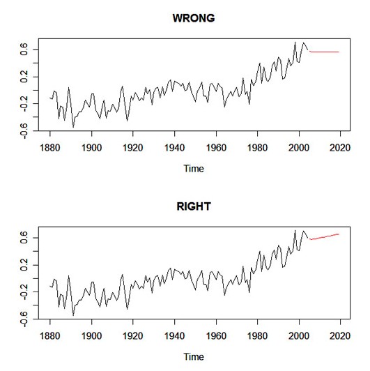
If you want to get predictions from an ARIMA(p,d,q) fit when there is differencing (i.e., d > 0), then the previous issue continues to be a problem. Here's an example using the global temperature data from Edition 2 of the text. In what you'll see below, the first method gives the wrong results and the second method gives the correct results. If you use sarima and sarima.for, then you'll avoid these problems.
fit1 = arima(gtemp, order=c(1,1,1))
fore1 = predict(fit1, 15)
nobs = length(gtemp)
fit2 = arima(gtemp, order=c(1,1,1), xreg=1:nobs)
fore2 = predict(fit2, 15, newxreg=(nobs+1):(nobs+15))
par(mfrow=c(2,1))
ts.plot(gtemp,fore1$pred, col=1:2, main="WRONG")
ts.plot(gtemp,fore2$pred, col=1:2, main="RIGHT")
Here's the graphic:
| http://www.stat.pitt.edu/stoffer/tsa2/foreissue.jpg |
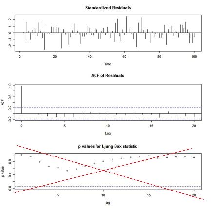
Issue 4: the wrong p-values
If you use tsdiag() for diagnostics after an ARIMA fit, you will get a graphic that looks like this:
| http://www.stat.pitt.edu/stoffer/tsa2/ex1.jpg |
The p-values shown for the Ljung-Box statistic plot are incorrect because the degrees of freedom used to calculate the p-values are lag instead of lag - (p+q). That is, the procedure being used does NOT take into account the fact that the residuals are from a fitted model.
Issue 5: lead or lag?
You have to be careful when working with lagged components of a time series. Note that lag(x) is a FORWARD shift and lag(x,-1) is a BACKWARD shift. Try a small example:
x = ts(1:5)
cbind(x, lag(x), lag(x,-1))

Time Series:
Start = 0
End = 6
Frequency = 1
   x lag(x) lag(x, -1)
0 NA     1         NA
1  1     2         NA
2  2     3          1
3  3     4          2 <-- here, x is 3, lag(x) is 4, lag(x,-1) is 2
4  4     5          3
5  5    NA          4
6 NA    NA          5
In other words, if you have a series x(t), then
y(t) = lag{x(t)} = x(t+1), and NOT x(t-1).
This seems awkward, and it's not typical of other programs. But,
that's the way Splus does it, so why not R? As long as you know the
convention, you'll be ok ...
... well, then I started wondering how this plays out in other
things. So, I started playing around with some commands. In what
you'll see next, I'm using two simultaneously measured series
presented in the text called soi and rec... it
doesn't matter what they are for this demonstration. First, I
entered the command
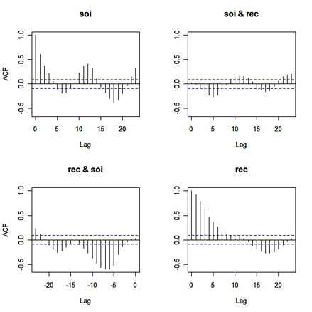
acf(cbind(soi, rec))
and I got:
| http://www.stat.pitt.edu/stoffer/tsa2/ccf0.jpg |
Before you scroll down, try to figure out what the graphs are
giving you (in particular, the off-diagonal plots ... and yes
they're CCFs, but what's the lead-lag relationship in each plot???)
...
.
.
.
... here you go:
| http://www.stat.pitt.edu/stoffer/tsa2/ccf.jpg |
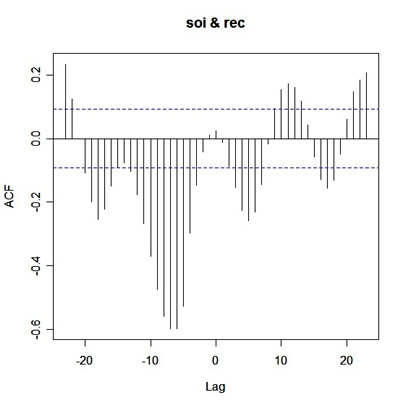
The jpg is messy, but you'll get the point... the writing is
mine. When you see something like 'rec "leads" here', it means rec
comes in time before soi, and so on. Anyway, to be consistent,
shouldn't the graph in the 2nd row, 1st column be corr{rec(t+Lag},
soi(t)} for positive values of Lag ... or ... shouldn't the title
be soi & rec?? oops.
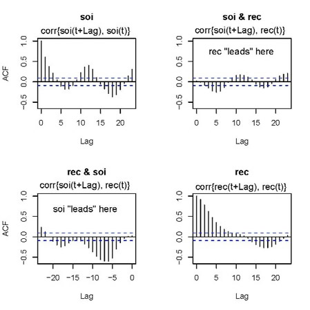
Now, try this
ccf(soi,rec)
and you get
| http://www.stat.pitt.edu/stoffer/tsa2/soirec.jpg |
What you're seeing is corr{soi(t+Lag), rec(t)} versus Lag. So on
the positive side of Lag, rec leads, and on the negative side of
Lag, soi leads.
We're not done with this yet. If you want to do a regression of x
on lag(x,-1), for example, you have to "tie" them together first.
Here's an example.
x = arima.sim(list(order=c(1,0,0), ar=.9), n=20)  # 20 obs from an AR(1)
xb1 = lag(x,-1)
## you wouldn't regress x on lag(x) because that would be progress :)

##-- WRONG:
cor(x,xb1)  # correlation
   [1] 1     ... is one?
lm(x~xb1)   # regression
  Coefficients:
  (Intercept)          xb1
    6.112e-17    1.000e+00
do it the WRONG way and you'll think x(t)=x(t-1)


##-- RIGHT:
y=cbind(x,xb1)   # tie them together first
lm(y[,1]~y[,2])  # regression
  Coefficients:
  (Intercept)       y[, 2]
       0.5022       0.7315

##-- OR:
y=ts.intersect(x,xb1)  # tie them together first this way
lm(y[,1]~y[,2])  # regression
  Coefficients:
  (Intercept)       y[, 2]
       0.5022       0.7315
cor(y[,1],y[,2]) # correlation
  [1] 0.842086

By the way, (Intercept) is used correctly here.
R does warn you about this (type ?lm and scroll down to "Using time series"), so consider this a heads-up, rather than an issue. See our little tutorial for more info on this.
Issue 6: u-g-l-y, you ain't got no alibi
When you're trying to fit an ARMA model to data, one of the first things you do is look at the ACF and PACF of the data. Let's try this for a simulated MA(1) process. Here's how:
MA1 = arima.sim(list(order=c(0,0,1), ma=.5), n=100)
par(mfcol=c(2,1))
acf(MA1,20)
pacf(MA1,20)
and here's the output:
| http://www.stat.pitt.edu/stoffer/tsa2/ma1.jpg |
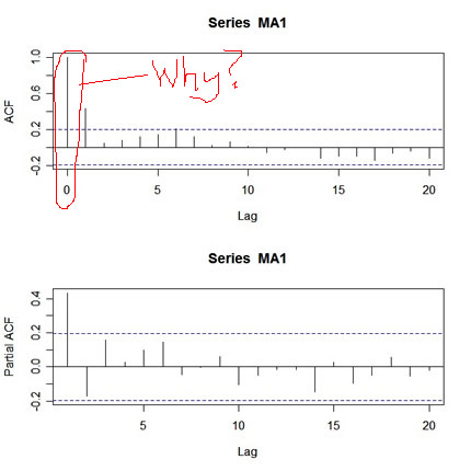
What's wrong with this picture? First, the two graphs are on different scales. The ACF axis goes from -.2 to 1, whereas the PACF axis goes from -.2 to .4. Also, the lag axis on the ACF plot starts at 0 (the 0 lag ACF is always 1 so you have to ignore it or put your thumb over it), whereas the lag axis on the PACF plot starts at 1.
So, instead of getting a nice picture by default, you get a messy picture. Ok, the remedy is as follows:
par(mfrow=c(2,1))
acf(MA1,20,xlim=c(1,20))   # set the x-axis limits to start at 1 then
                           # look at the graph and note the y-axis limits
pacf(MA1,20,ylim=c(-.2,1)) # then use those limits here
and here's the output:
| http://www.stat.pitt.edu/stoffer/tsa2/ma1a.jpg |
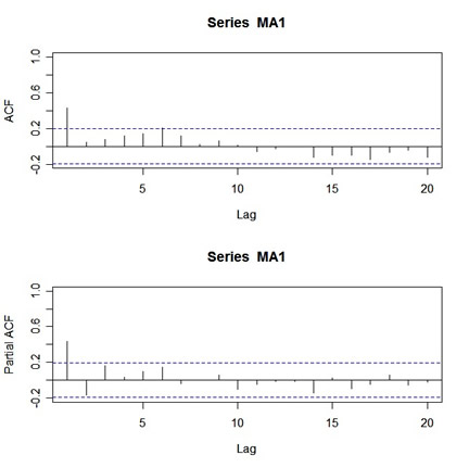
Looks nice, but who wants to get carpal tunnel syndrome sooner than necessary? Not me... and hence acf2 was born.
![]() 喜欢
喜欢
0
![]() 赠金笔
赠金笔